Biker Boy Typeface
Typography – Illustration
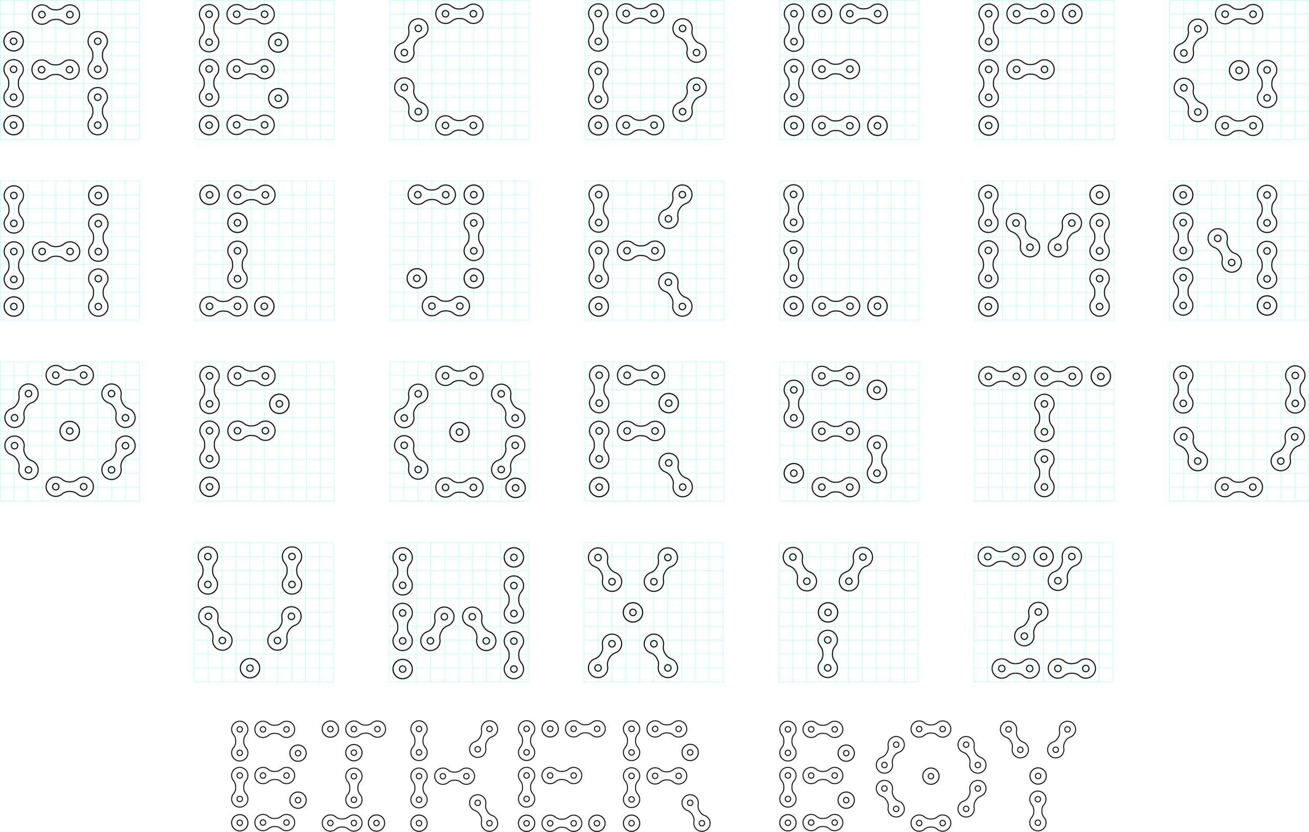
This project’s goal was to create a decorative typeface based on motorcycling, a poster to display the type, and an event poster using this typeface. The two biggest challenges of this project were cohesiveness and legibility of the font, as the font was created to mimic the chain that drives most motorcycles. Creating consistently sized type with the singular shape of an outer chain link proved to be quite difficult, so a “half chain link” had to be created for the sake of spacing and shape. The design was made with only outer chain links, which are unconnected – this allows the viewer’s eyes to fill in the blanks and make the shape. The primary audience for use is graphic designers, but for viewership it is geared towards people who enjoy mechanical concepts, motorsport enthusiasts, and motorcyclists. Additionally, because the chains of both motorcycles and bicycles are visually similar, the typeface fits well in the world of bicycling as well. The display poster is left simple to keep the focus on the typeface. An image heads the top half, with a box breaking in to show the name of the typeface – Biker Boy – and its creator’s name. On the bottom, the 26 letters of the typeface are displayed in a centered, aligned manner with adequate space for the viewer to look at each letter. The event poster is for a ride-in show. It features a large illustration of a café racer style helmet, and a large title with the Biker Boy typeface. The type is intended to call back to vintage racing posters. Below the title, several events in chronological order outline the day of the bike show. These media items successfully present a visually interesting typeface and its use in relevant media.
Type Layout
Poster Implementation

More Work
